
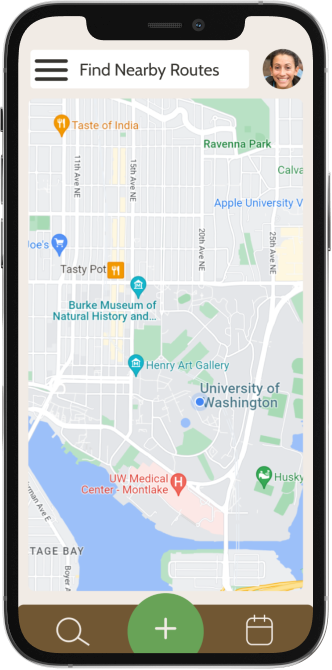
Router
Class Project
Key Features
-

01
Generate a walking route based on preferences and accessibility
-

02
Explore pre-existing walking routes in your area
-

03
Regenerate routes until you find one you like
-

04
Add events to your calendar and invite friends to join you
-

05
Save your favorite routes to use later and share to the world
Design Evolution


Context
Class project
Team size
3 teammates
Time frame
10 weeks
My role
UX/UI designer
Problem Statement
Finding our focus
After exploration of many topics, we decided to focus on the common COVID-19 problem of “how can I get outside more?”
Prompt
Consider the multiple pandemics and unique challenges of the past 253495+ months. Design a solution to one of the many pandemic related issues and abnormalities.
Design Goal
Improve the experience of going for a walk in a city environment by making it customizable, accessible, and social.
Platform
We chose to design a mobile app for for easy access to navigation while on walks.


Getting to know our users
How can we better understand the emotions and pain points of our user base?
In order to empathize and better understand our potential users, we began conducting semi-structured user interviews.
Each team member held a 1:1 semi-structured interview with a member of our target audience, where we focused our discussion on getting outdoors, city exploration, the social aspects of getting outdoors, and accessibility issues.
Target Audience
Anyone in the city hoping to spend more time outdoors
Research Participants
University of Washington College students who live on campus
Overall Goal
Empathize with users and identify their needs
What we learned
User Goals
Users want to get outside on a regular schedule, explore their city, and find lesser-known places.
Motivations
Users want to keep life interesting and exciting, and improve mental health through exercise.
Pain points
Users find it hard to find new routes beyond their neighborhood that makes them feel safe and meet their needs
Comparing our design goals to existing solutions: how do we measure up?
To investigate this, we conducted a competitive and inclusive design analysis on a similar company.
We chose to analyze AllTrails, the trail way-finding app, because the arrangement and mission of the app is similar to our design goals.
Click here to see the full document


Defining our users
What resources can we create to better understand the point of view of users?
First, we developed personas to represent characteristics and desires of potential users.
Individually, each member of the group brainstormed around three fictional personas to represent the culmination of research done on our user base. We then came together and combined our ideas to develop two polished personas that we would reference throughout the design process.
Click here for a closer look


Then, we created a user journey map to better understand the point of view of our fictional personas.
As a team, we used our fictional persona named “Mattea” to imagine how going on a walk typically felt for her, and what pain points came along with it. Having a map of her emotions during our targeted experience helps us better empathize with the user and create an experience truly tailored to their needs.
Click here for a closer look

What we learned
By gaining a more concrete understanding of our potential user base and their needs, we were able to make informed decisions regarding the main features of the app and overall design goals.
Designing a solution
In what ways might we utilize our insights to design a solution?
We made this transition by utilizing our research findings to establish design requirements and goals that will serve as a foundation for developing our prototype.
These design requirements outline the exact functions we need to prototype. This list was designed based on the user research, personas, and journey map.
Design Requirements

Design Goals

How do our design requirements translate to real world scenarios?
We explored this by using storyboards to conceptualize how our design solution by be used in potential use cases
Storyboards were created by each individual team members to help bring potential uses of the app alive.
Scenarios explored are: feeling bored of walking around your neighborhood, wanting to find a safe place to walk, inviting friends to go on walks with you, and wanting to find a paved route to ride a longboard through.
For a closer look, click here.


What we learned
After gaining a better understanding of user scenarios and design requirement, we decided to focus on promoting exploration of the users environment, customization of routes, and connection with others in the first iteration of our prototype.
Low-Fidelity Prototype
For our low fidelity prototype, we focused on the basic interactions and flow of the app, and aimed to find out how it would feel to use at a very basic level. We created a few pathways for this prototype: creating a new route with filters, choosing a pre-existing route, creating an event in the calendar, messaging a friend, and viewing the user profile.
Click here to explore the low-fidelity prototype
Annotated Wireframes
We then created a detailed account of each page and feature of our prototype in order to better understand the product at this stage, compare it with our previous design requirements, and decide which flows would be tested with users.
Click here to view all annotated wireframes

User Testing Results
At this stage, 3 participants navigated the low-fidelity prototype, each with a unique goal: create a new custom route, find a pre-existing route, and add an event to the calendar.
Click here to view the full evaluation

What we learned
The three essential user flows (creating a new route based on advanced filters, choosing a pre-exiting route, and adding an event to the calendar) were mostly easy to navigate. However, user testing revealed that certain buttons are hard to reach and that headings needed to use more clear and direct language.
High Fidelity Prototype

In the development of the high-fidelity prototype, we took user feedback into consideration to make improvements, and refine the visual styles.
Reflection
While the user flow and information architecture of the app work well to satisfy the purpose of the app, it lacks some beneficial UX elements in its visual design/UI. In order to address and improve these issues, I continued to iterate on the design after the class concluded. Scroll to see my process and improvements!
What changes can be made to improve the design?


After closely examining the first iteration, I came up with the following four areas of improvement:

